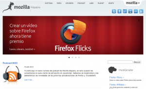
This week we have just landed the new brand and site redesign at Mozilla Hispano.
It’s been a long time of hard work and discussions about how to full redesign the community site, since we wanted to do not just a restyle but also a brand redesign reflecting who we are and what we do.
(Versión en español de este artículo)
Goals
- Keep it simple.
- Align with the rest of mozilla sites design and brands.
- Feature the areas we felt they were more important.
- Give more visibility to social networks.
- Optimize the site to different devices.
The first thing we did was the brand redesign, refreshing the logo and brand images. We wanted to be consistent when communicating the community brand everywhere: From social networks to events, news in other sites…
Then we discussed for a long time how to deal with the site redesign asking the community at our mailing list, defining a working group and setting several audio meetings to get a final idea. We followed the new mozilla.org redesign very closely and we inspired the redesign on ideas that were going be applied there. Also the mozilla brand toolkit from creative team was extremely helpful to be on the same page.
Having in mind that we have different areas on the site, we also had to think how to restyle the support forums and the wiki to fit the mainpage design, having in mind the same principles.
Thanks to Fjaguero, stripTM for helping with the frontend and Willyaranda for the IT stuff (we also took the opportunity to migrate from our old server to a new awesome one thanks to Mozilla Community Hosting program).
What’s next?
Responsive design
We haven’t applied the responsive design for mobile and tablets yet, we are still finishing it and will be available in the next weeks.
Tabzilla l10n
Currently it’s not possible to localize the new mozilla univeral tab content, we have opened a bug for it. If you know js, please help sending a patch to speed up the process, tabzilla devs are really busy right now.
